Refbox
Core Concepts

Toolbar

Quick access to common actions from the vertical toolbar beside your Box.

The Toolbar is the vertical strip of icons beside your Box. It provides fast access to common actions without opening menus or using keyboard shortcuts.
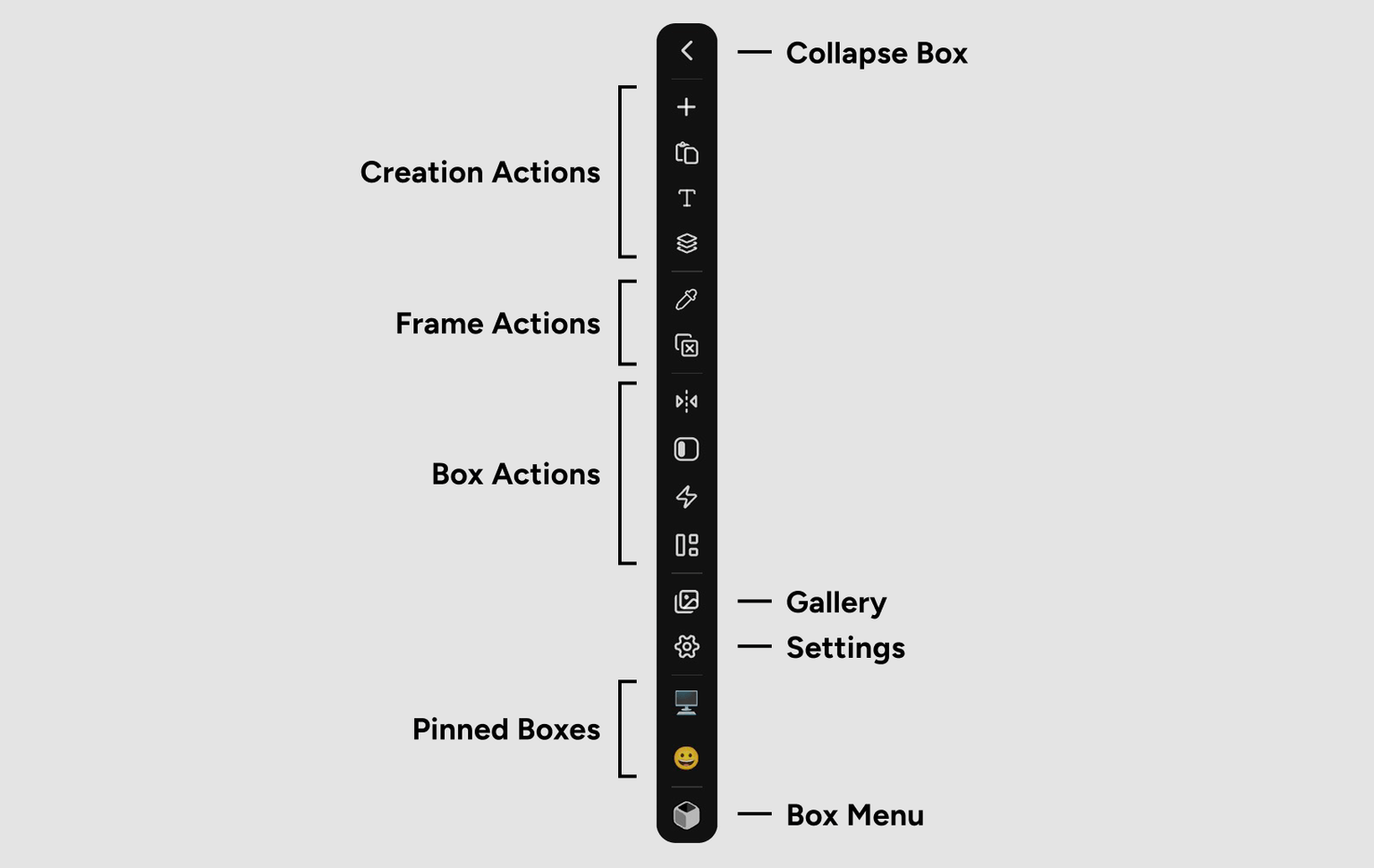
The Toolbar with various action buttons

Toolbar actions can be shown or hidden in Settings, so your Toolbar may look different from these examples.

Toolbar Actions

The Toolbar is organized into functional groups:

Creation Actions

Add new Assets to your current Box or create Group Frames:

Add File
Open a file browser to select and import files from your computer.
Paste from Clipboard
Paste content from your clipboard (images, files, or URLs).
Add Note
Create a new text note Asset.
Add Group
Create a new Group to organize related Assets.

Creation actions in the Toolbar

Frame Actions

Manage Frames on your workspace:

Color Picker
Activate the color picker tool to sample colors from any Frame.
Close Frames
Close all open Frames at once.

Box Actions

Control how your Box appears and behaves:

Hide Box
Hide the Box sidebar to maximize workspace area.
Flip Sides
Move the Box from left to right or right to left.
Auto Hide Box
Toggle Auto Hide behavior for the Box.
Keep Toolbar Open
Toggle whether the Toolbar stays visible or appears only on hover.
Masonry Mode
Toggle between Standard and Masonry layout modes.

Box control actions in the Toolbar

View & App Actions

Access app-level features:

Gallery View
Open Gallery View to browse all Assets in full-screen.
Settings
Open the Settings panel.
Boxes Menu
Open the Boxes Menu to switch, create, or edit Boxes.

View and app actions in the Toolbar

Boxes Menu

The Boxes Menu provides access to all your Boxes and Box management:

Switch Boxes
Click any Box in the list to switch to it.
Create Box
Click Add Box to create a new Box.
Edit Box
Click the edit icon next to a Box name to rename, change icon, export, or delete.
Pin/Unpin Boxes
Pin frequently-used Boxes to appear as quick-access buttons in the Toolbar.

The Boxes Menu with pinned and unpinned Boxes

Pin your most-used Boxes to the Toolbar for instant access without opening the Boxes Menu.

Using the Toolbar

Click Actions

Click any Toolbar icon to trigger its action immediately. Most actions execute instantly, while some (like Add File) open dialogs for additional input.

Hover for Tooltips

Hover over any Toolbar icon to see a tooltip explaining what it does. This helps you learn the Toolbar layout quickly.

Hovering to see tooltips

Keep Toolbar Open

By default, the Toolbar appears on hover. Enable Keep Toolbar Open to make it visible at all times:

  1. Click the Keep Toolbar Open toggle in the Toolbar
  2. Or enable it in Settings > Behavior

This is useful if you frequently add Assets or switch Boxes throughout your workflow.

Toggle to keep Toolbar always visible

Customizing the Toolbar

Customize which actions appear in your Toolbar:

  1. Open Settings
  2. Navigate to the Toolbar tab
  3. Toggle actions on or off based on your workflow

Hide actions you rarely use to keep your Toolbar compact and focused.

Customizing Toolbar actions in Settings

Hide rarely-used actions to keep your Toolbar streamlined and focused on your most common tasks.

Toolbar behavior can be customized in Settings:

  • Keep Toolbar Open (Settings > Behavior): Always show Toolbar vs. show on hover
  • Toolbar Actions (Settings > Toolbar): Toggle which actions appear
  • Auto Hide Box (Settings > Behavior): Control Box sidebar behavior

Tips and Best Practices

Pin frequently-used Boxes to the Toolbar for instant switching without opening the Boxes Menu.
Enable Keep Toolbar Open if you frequently add Assets or create Groups during active work sessions.
Customize Toolbar actions to show only the features you use regularly, keeping your interface clean.
Use Flip Sides to quickly move the Box when you need it on the opposite side of your screen.